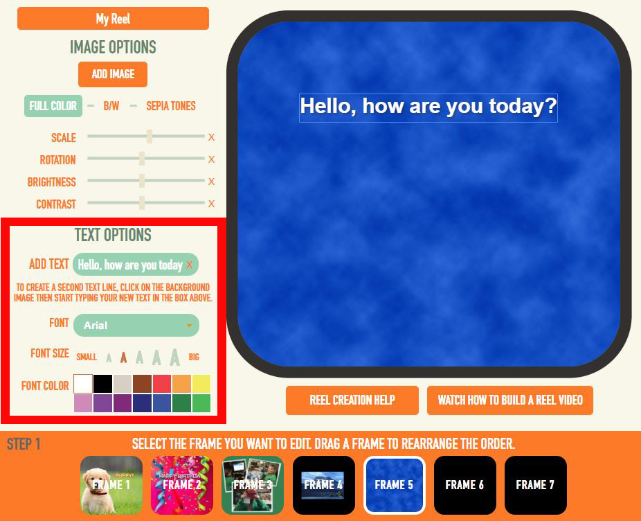
Did you know that you can add 3D captions to your reels by using our Reel Builder's text tool?
It's true! And how cool is that? Simply input text within our reel builder's text tool, and the text will automatically be in 3D! (this does not work if your text is on your picture before you upload it).
Here is more helpful information regarding text....
(you can click one of these sub-topics or read the entire post)
*Adding 3D Text With Our Text Tool
*Pictures With Text Already Included
*Picking Smart Colors and Fonts
___________________________________________________________
Adding 3D Text With Our Text Tool
First and foremost...one of the coolest things about our Reel Builder is that you have the option of adding 3D text to your frames!
To add 3D text, all you need to do is use our text tool when building your reel. You can change the color, manipulate the size, and move it to any desired position around the frame.
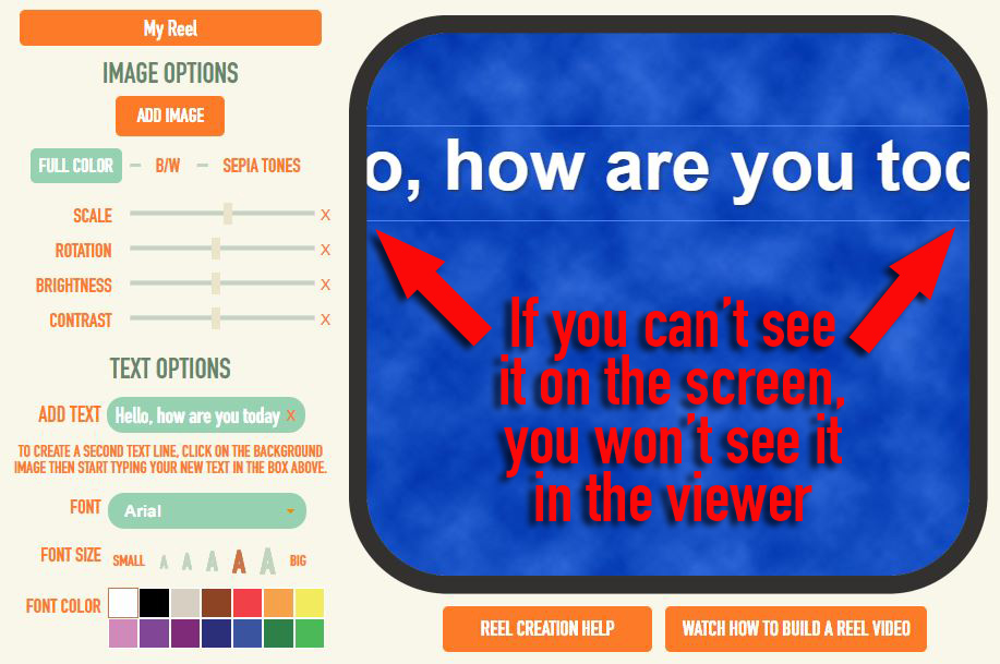
Keep in mind, that if your text goes beyond the edges and you cannot read it anymore, you will not see it within the viewer either. Those are the crop lines and anything beyond that will be cut off.
___________________________________________________________
Pictures With Text Already Included
Now sometimes, customers like to get really creative and design their text-filled images outside of our Reel Builder, in Photoshop, for example. This is great, but there are a few very important points to consider.
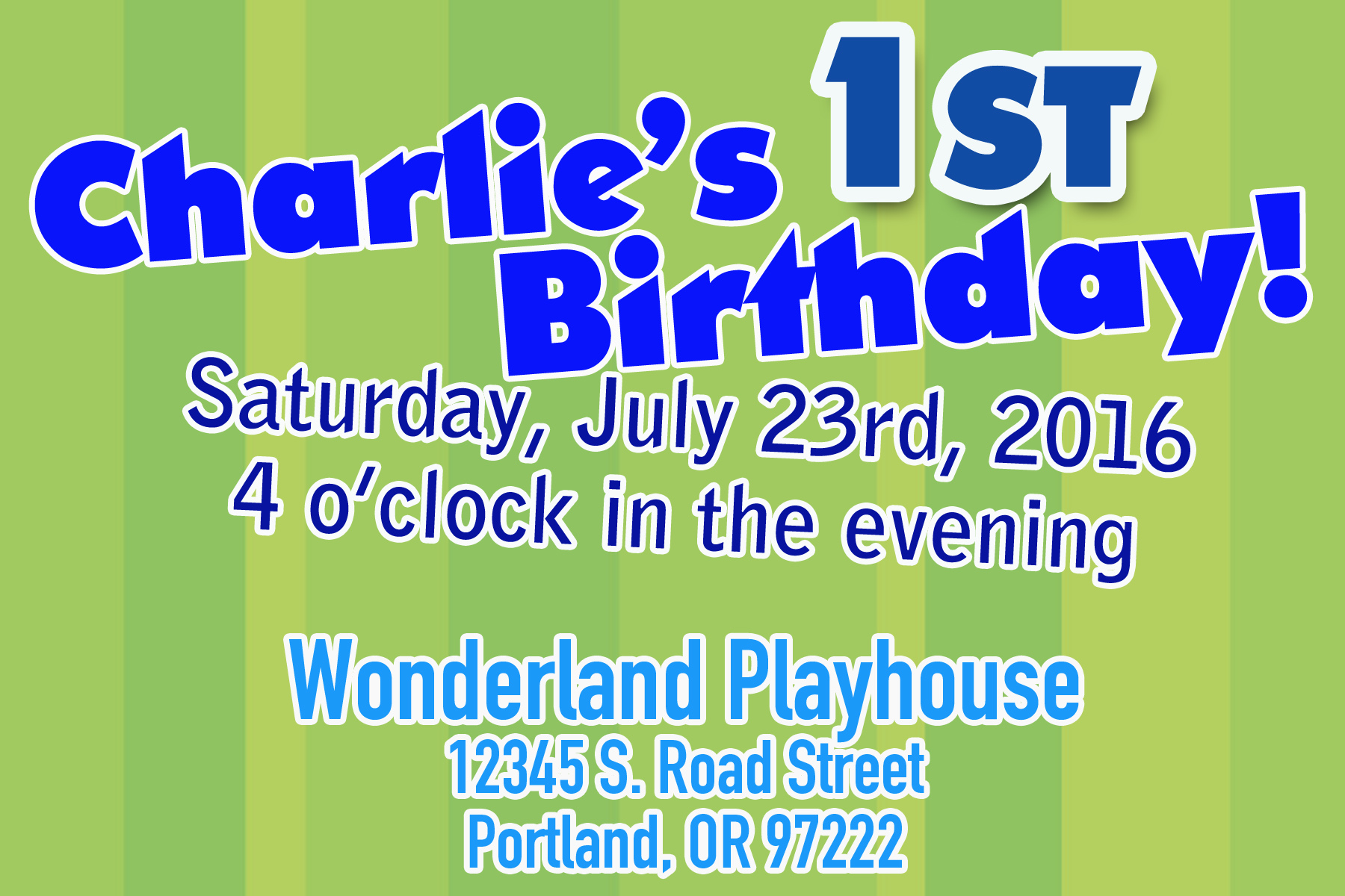
This picture looks nice, right? The party information is informatively typed out, it's designed evenly, and fills out the entire frame, a standard 4 x 6 size.
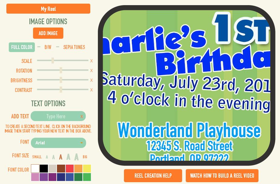
But uh oh! After uploading the picture, your text lands outside of the frame.
The most important thing to remember is that reel frames are square. You do not want to extend important information all the way to the edges of your images.
For this reason, we have an awesome template you can use if you want to design your images before uploading them. Please contact us for the template.
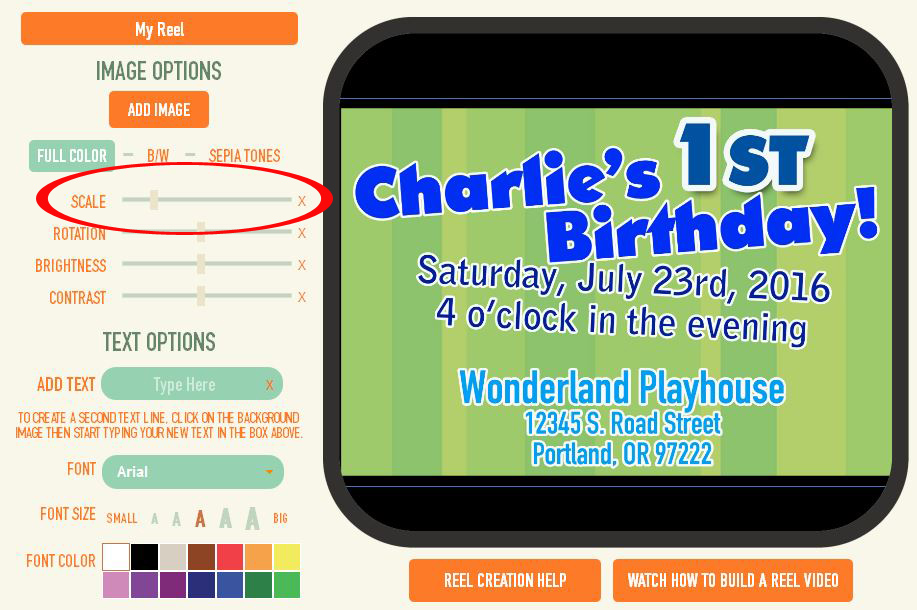
Options to fix this would be to re-do your picture (use our template for best results) and re-upload. Or, you can always scale the image out to ensure everything fits.
___________________________________________________________
Choosing the Right Text Size
When adding text to your picture before uploading, it is imperative to make sure that you do not make your text too small. What may look fine in Photoshop, does not always work with the reel and viewer.
Remember, your images are being shrunk down to a size that is less than 1 inch by 1 inch. If your text is really small and you choose a font that has fine lines, it will get distorted and be illegible.
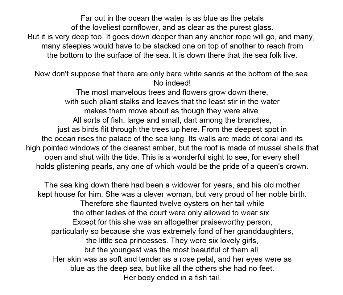
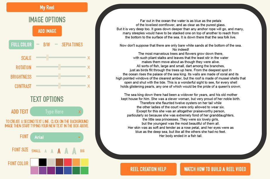
Take this picture for example. I typed a large amount of text (The Little Mermaid!) and it looks great and totally legible.
But, adding it to the Reel Builder shows a different story...
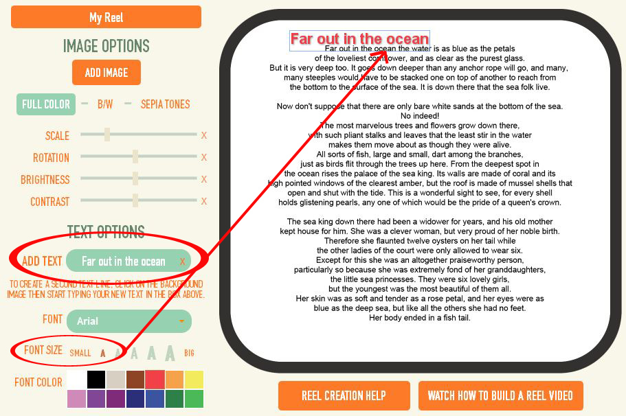
A good an easy way to test if your text size is big enough is to use our text tool as an example.
Upload your text-filled picture. Then, type in a few words from your text, and choose the smallest font size we offer. Now, put it next to your text and compare.
Is your text smaller that our smallest size text? If so, you will need to increase the size of your text before uploading.
Or, better yet, use our text tool to ensure your text can never be too small. (Contact us if you want to use our template that shows the smallest text size you should use)
___________________________________________________________
Picking Smart Colors and Fonts
This is important for both do-it-yourself and using our text tool!
Rule of thumb is just to pick good background/font color combos.
For example you wouldn't do silver on top of white, because it just doesn't pop. But now silver on top of black, that pops!
It is also recommended that you do not use overly-cursive or funky type. If you must, make sure it is very large.
Remember, your images is being shrunk down to a size that is less than 1 inch by 1 inch.
Here is an example of a cursive-type font. The picture doesn't look too bad, but once it is shrunk down for the reel, it gets harder to read. Also, the background is so busy that it decreases visibility when mixing it with cursive font.
Just think of your recipients eyes! Would Grandma be able to read what it says?
Check out more of our helpful tips posts






3 Comments